COMPLICATIONS vs WIDGETS on the Apple Watch: What “wins” and why?
I ended a recent blog post with the following…
“It is my belief that as more 3rd Party developers create widget options I, along with others, will begin to reimagine what warrants space as a complication and what works better as a widget. I do not think I would have come to this conclusion had I not had access to CARROT’s widget options.”
I was of course talking about widgets on the Apple Watch, a new feature coming to watchOS 10 this fall, available now to those of us “daring enough” to put betas on our devices.
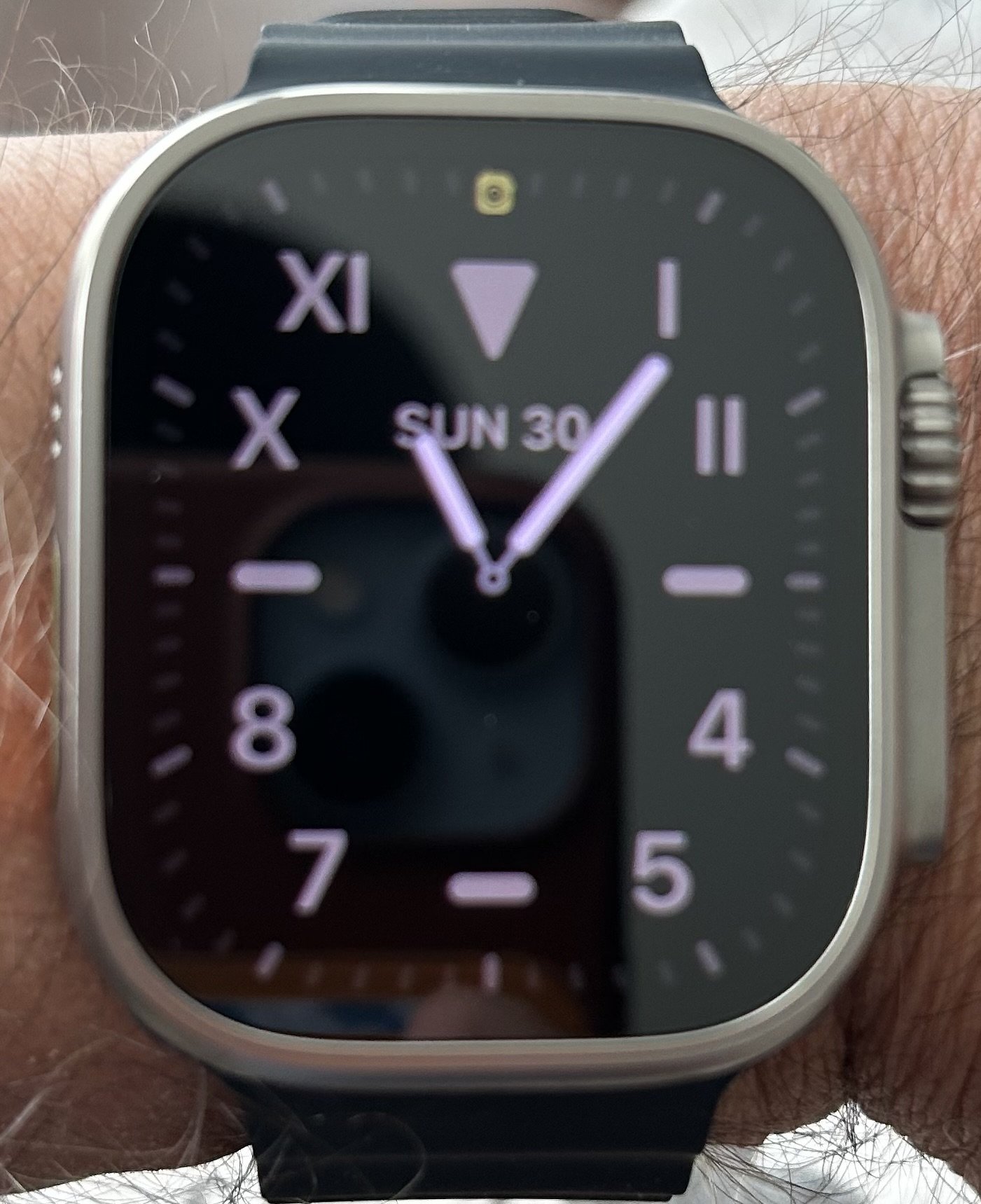
This whole concept of complication versus widget really intrigues me. I currently have 8 complications on my beloved Apple Watch Ultra’s Wayfinder watch face. Truth be told, I have them there because; I can. Here is pic of the Wayfinder watch face in all its glory…
8 complications because, you can!
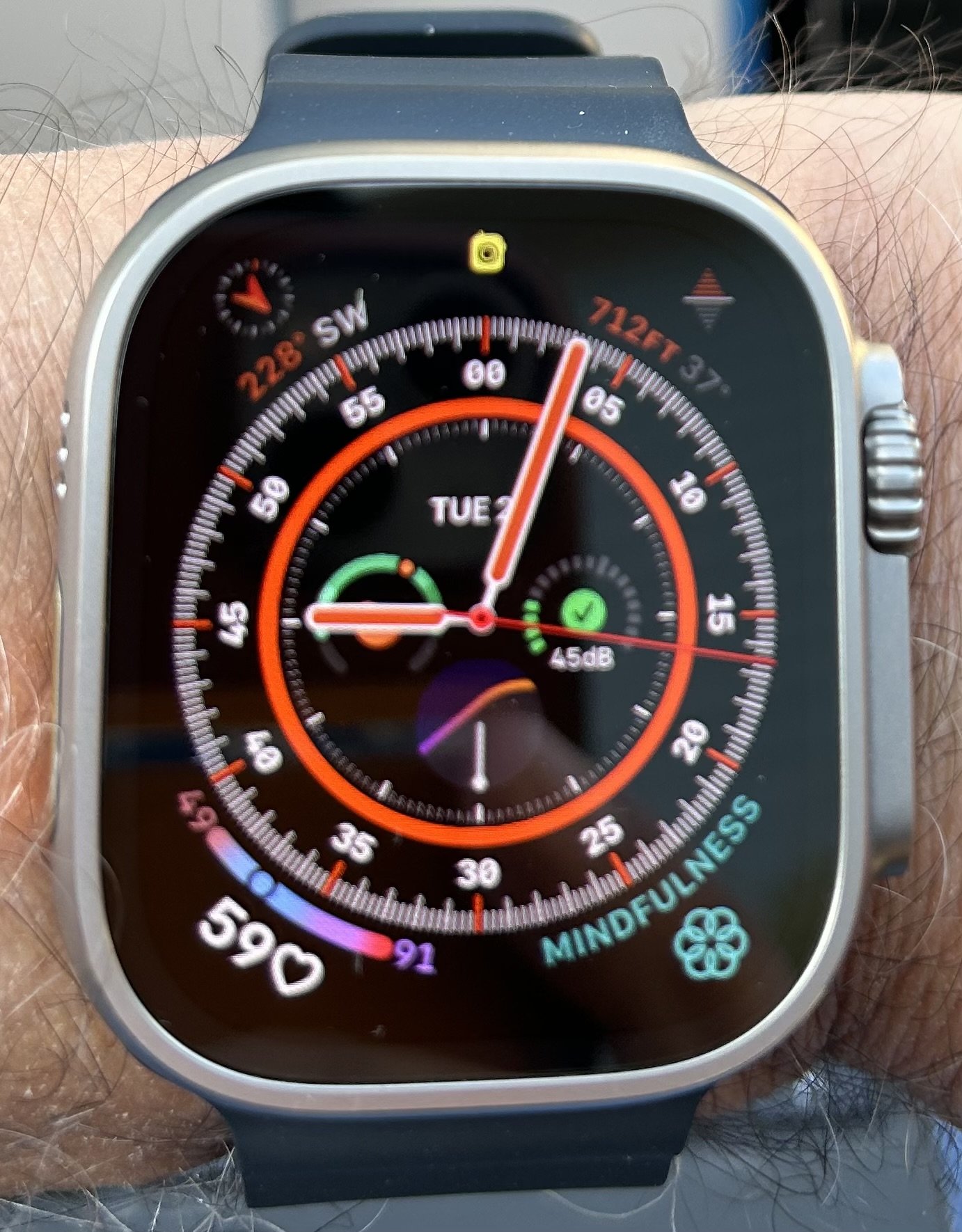
I know that “mileage will vary” depending on the user but right now, as I sit here, I think I could easily get rid of 5 of the 8 complications as they are literally just taking up space on the watch face. Of these 5, 2 would be better served as widgets and if I’m lucky enough, the developers of these apps will eventually provide users like me that capability. Of the 3 complications I would keep, 2 could move into the sub-dial positions, along with the “Today’s Date” complication leaving me with no complications at all in the corners.
Here is a pic of what the Wayfinder watch face looks like after taking complications off and moving a few…
This just doesn’t look right.
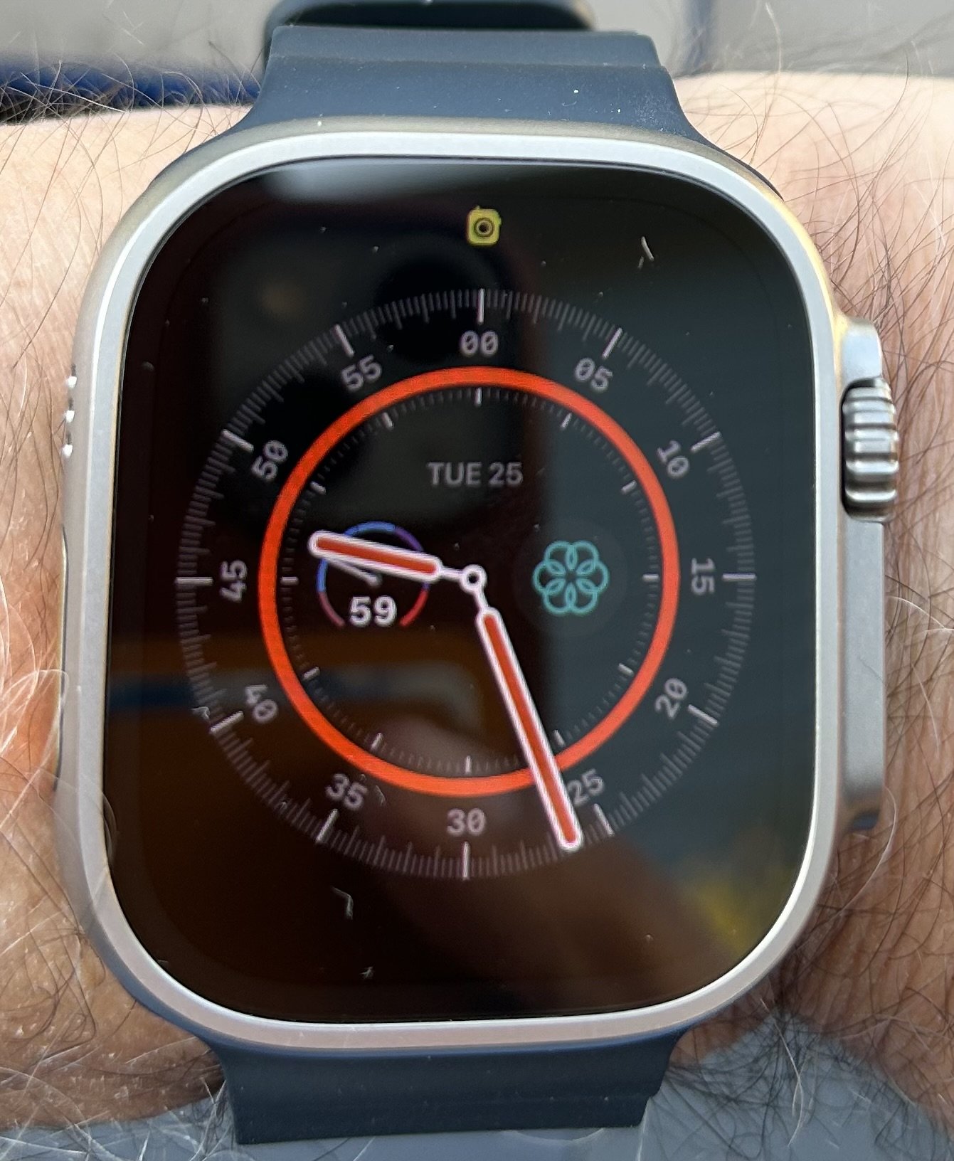
It just doesn’t look the same. In my opinion, the Wayfinder watch face looks its best when sporting as many complications as it can hold. This realization led me to look for another watch face that would look good with the 2 complications I wanted to keep; the HeartWatch “Daily Avg. Dial” complication and the Mindfulness complication. I wasn’t successful in finding something that matched my tastes so, I moved Mindfulness to a widget and am now “rocking” the California watch face with the HeartWatch complication.
Here is a pic of what that looks like…
Elegant and functional.
To conclude, for now, I guess it is safe to say that widgets on the Apple Watch has led me to a “less is more” mindset when deciding what needs to be a complication and what is better served as a widget.
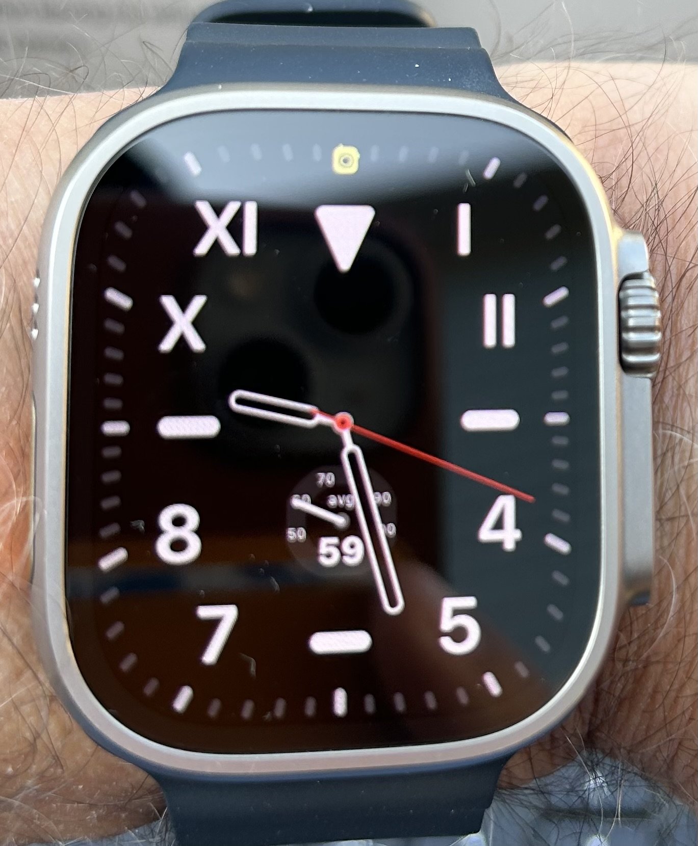
Update: Since writing this post I’ve gone one step further in my experiment with just using widgets on the Apple Watch. I went ahead and took the HeartWatch complication off of the California watch face and am now using Apple’s native Heart Rate widget instead. It gives me as much information as the HeartWatch complication gave me access to in a way that only Apple can do currently. I say this because I reached out to the developer of the HeartWatch app asking if they had plans to create a widget for the Watch and was basically told no. Here is a pic of my watch face now…